Getting Started
Ideal Forms (iforms) for Jira are custom web forms that run on top of your Jira software. Ideal Forms are similar to MS Access forms in that they are point and click configurable with properties and events etc.
If you think of Jira Project as the database then the iforms are just wired up visual representations of the Project data.
To get started:
1. Install Ideal Forms for Jira: Found in the Jira Marketplace, if you have difficulty finding it please contact us.
2. Refresh and Run: Once installed, refresh your browser, you will see an "Ideal Forms Admin" link in the Add-Ons screen.
3. Create a Form Group: All forms must be in a "Form Group" to help organize iforms. Click Add on upper left side of administration window.
4. Create a Form: Click Add Form at bottom of screen, name it and select your form group, save.
5. Design Form: Select your new form and click "Design Form".
6. Run Form: Double click form or select form and click "Open".
Tip: Click here for importing and exporting forms instructions.
back to topics
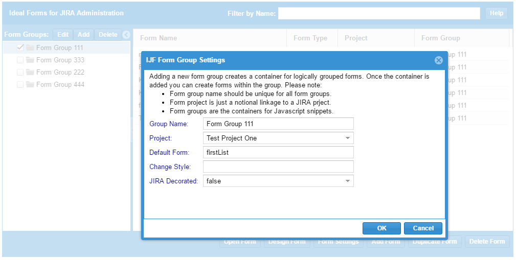
iForms are organized by "Form Groups." All forms must be in one and only one Form Group. This concept helps organized forms around particular
use cases, and it gives us a container to hold Javascript business rules for the Form Group. It also allows us to set a 'default' form for
a form group to allow a 'Done' button a place to navigate. Settings are:
Group Name: A descriptive name for your form group.
Project: A selected Project from your Jira instance. This is required for Add forms to set Issue types.
Default Form: This is the name of a Form to open when a user clicks "Done" in any form of the group.
Change Style: This overrides the CSS change style for changed fields. It defaults to a blue bar on the right.
An example is:
{border:solid red 2px}
Anon Username: This is the Jira username to use for anonymous form access. (Obviously, be careful with what permissions you grant this account)
Anon Password: This is the anonymous username's password.
Jira Decorated: This determines if the form will include a Jira background when open from the administrator.
Adding and Editing a Form Group
From the main Ideal Forms for Jira Administration screen click the "Add" button to Add a Form Group or click the "Edit" button if you want to edit.
back to topics
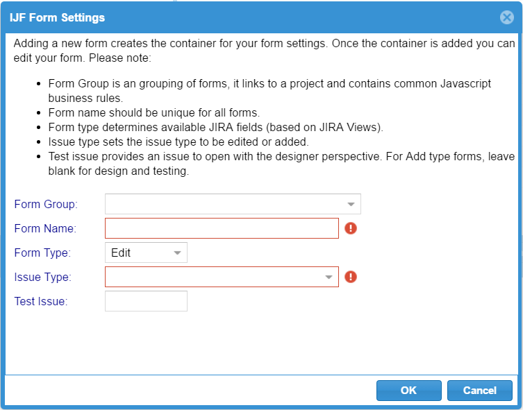
iForms are defined from the administration menu with a few over arching configurations.
Configuration settings are:
Form Group: This is the form group the form will be a member of.
Form Name: A name for the form. Forms can have any names but should not have special characters and it is a good practice to name them "Form_[function]" or "SubForm_[function]".
Form Type: [Edit, Add, List]. This defines the expected behavior of a form and helps iForms load the correct Jira metadata when rendering.
Issue Type: [Required for Add type forms]. This sets the issue type for Add forms. The issue types are determined by the Form Group Project.
Test Issue: [Required for Edit type forms]. This provides the form designer an Issue to use when designing the form.
Adding and Editing a Form
From the main Ideal Forms for Jira Administration screen click the "Add" button to Add a Form or select a form click the "Edit" button if you want to edit.
back to topics
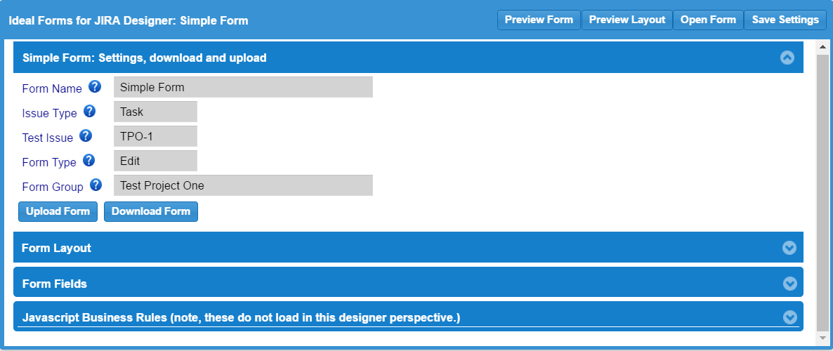
Once you have created a form from the administration screen you can then design it.
Designing a form is done by selecting your form and clicking the 'Design Form' button.
This will open the form in the Form Design mode like the following.

The form design dialog provides a configuration approach similar to other form designers like MS Access. The commands
at the top along with the top accordion section provide the following:
Preview Form: Will re-render the form to the body of the browser
Preview Layout: Will show you the cell layout of the form.
Open Form: Will pop a new window and render your form from the saved settings.
Save Settings: Will save your settings to the Ideal Forms store within Jira.
Form Name: Is the name you set from the administration menu.
Issue Type: Issue type is set from the administration menu and defines the type of issue for an Add type form.
Test Issue: Test issue is the issue used to open the designer for Edit type forms.
Form Type: Determines if it is an Add or Edit form. (Note, Add type forms will behave like Edit type forms if opened with an Issue key.
Form Group: Is the group the form belongs to. Groups link to Project and hold Javascript business rules.
Upload Form: Will open a form file from your computer and load into this browser window. Uploading does not save to the Jira instance.
Download Form: Will save this form settings to a file on your computer (typically in 'downloads').
back to topics
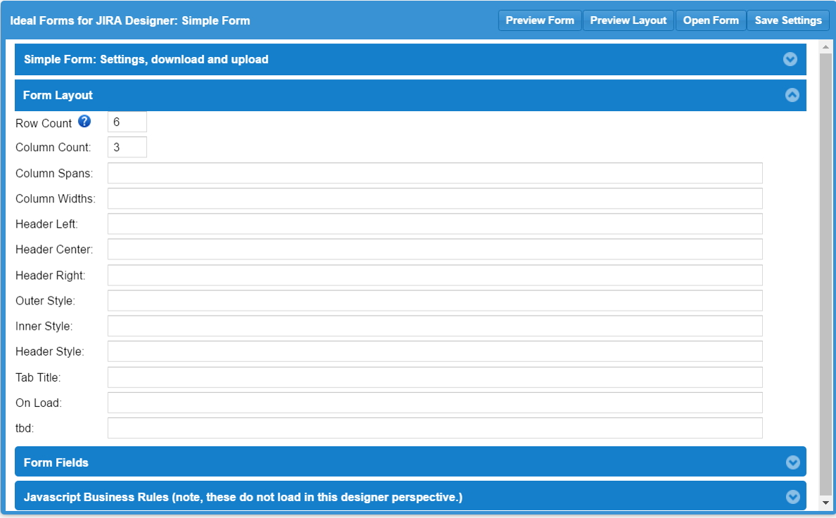
Form settings configure the layout of the form. Basically, forms are laid out as a table with
a number of rows and a number of columns, with one additional section at the top for a header. Each cell of the table
will house a single control element or a subform. The
cells of the table can be merged using the span setting. (Hint, use the 'Preview Layout' to see the
cells you are constructing.) The following are the settings and their meaning.
Row Count: Number of rows in your form.
Column Count: Number of columns in your form.
Column Spans: This allows you to merge cells in the same row. The syntax is a ";" concatenated list of "x,y,z" where x,y is the cell address and "z" is the number of cells to merge including the starting cell. For example, for an 8 x 8 table
, to set row two as two cells spanned for four cells each is "2,1,4;3,5,4"
Column Widths: Sets the widths of each of the form columns. Syntax is a ";" concatenated list of "x:y" where x is the column and y is the width. For example
to set a 3 column table with 300px columns is "1:300px;2:300px;3:300px". Percentages can also be used.
Head Left: Above the table is a header row, this is the left hand side. *
Head Center: This is the center of the header row. *
Head Right: This is the right hand side of the header row. *.
Outer Style: This is an outer containing DIV including title, all styles are CSS such as "background:blue;border: solid red 1px"
Inner Style: This is an inner containing DIV, all styles are CSS such as "background:blue;border: solid red 1px"
Head Sytle: This is the header DIV. CSS
Tab Title: This sets the value of the browser TAB containing the form.
On Load: This sets a javascript function to call at the on load event.**
* Hint. All text entries for the header can include replacement directives to display values from the issue. The syntax is: #{name} where name is the issue field such as Summary.
There also a few additional directives such as #{datetime} and #{user}
** Please see the section on Ideal Forms javascript programming
back to topics
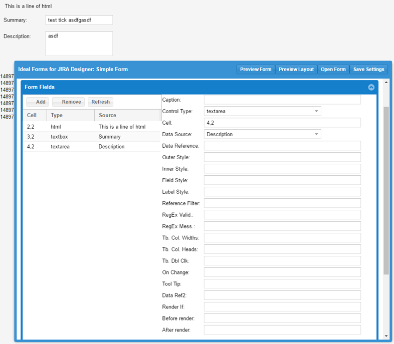
Form Fields set the controls to be placed in each cell of the form. The left hand side of the dialog shows each field and its cell assignment and
once selected a field's properties are shown on the right side.
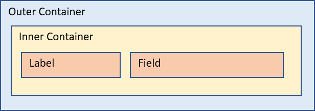
Generally speaking, each field is rendered to the page using this structure:
The following are summary descriptions of a field properties, note, many of these
settings do not apply for all control types.
Caption: This is the label of the field or button or link. If you leave blank the label will be derived from Data Source. If you enter "none", no label will show.
Control Type: Control Type is a selection of what object to render to the screen such as textbox or radio group. Note, for the control to render properly, the control type must be appropriate for
the selected Data Source, if there is a missmatch it will not render. Control Reference provides details on valid settings.
Cell: Address of the cell (row,column) to contain the field.
Data Source: The data value to bind or with control, this list is determined by the test issue in the designer. Note, if control type is HTML, then this contains the HTML to render to the screen.
Data Reference: This field is used by some control types when additional parameters are required.
Outer Style: Standard CSS that sets the outer container style of the control.
Inner Style: Standard CSS that sets the inner container style of the control.
Field Style: Standard CSS that sets the field container style of the control.
Label Style: Standard CSS that sets the label container style of the control.
Reference Filter: Settings for some controls to set filtering on the data.
RegEx Valid: Standard regular expression settings that will be used to validate the value of a field.
RegEx Mess.: A message that will display to the user if the regular expression fails to validate.
Tb. Col. Widths: For "itemlist" this optionally sets the widths of each column.
Tb. Col. Heads: For "itemlist" this optionally overrides the column headings.
Tb. Dbl Clk: Double click event for "itemlist", either: a form name that will open on the double click, passing the issue key. Or it calls a javascript business rule.
On Change: The on change event for the field. Named javascript function.
Tool Tip: A description that will show when hovering on a field.
Data Ref2: Additional reference information used by some fields.
Render If: A javascript function call that returns true or false. Result will hide or un-hide the field.
Before Render: A javascript function that fires before render.
After Render: A javascript function that fires after render.
Custom Types
back to topics
Custom Types allow you to create data elements not supported by Jira and data reference containers for
use within your forms. The following summarizes the kind of types you can create.
REFERENCE:This is text used to configure reference lists used by your forms in combo boxes or GRID dropdowns
The format of the value is text in either CSV form or JSON form.
GRID: This defines an EXTJS GRID for use within your forms.
FILE: This allows you to upload a BINARY file for use in your forms. Currently the only built in feature
that uses this function is the report button that reads a Word binary and replaces tags with Jira values.
